
♜Case study · Packaging design
Bitzel’s Chocolate: one gift bag, three flavours
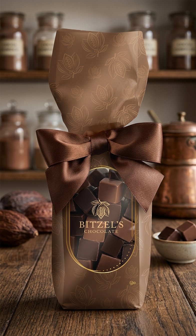
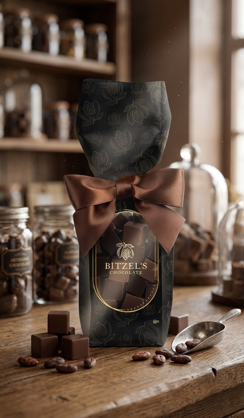
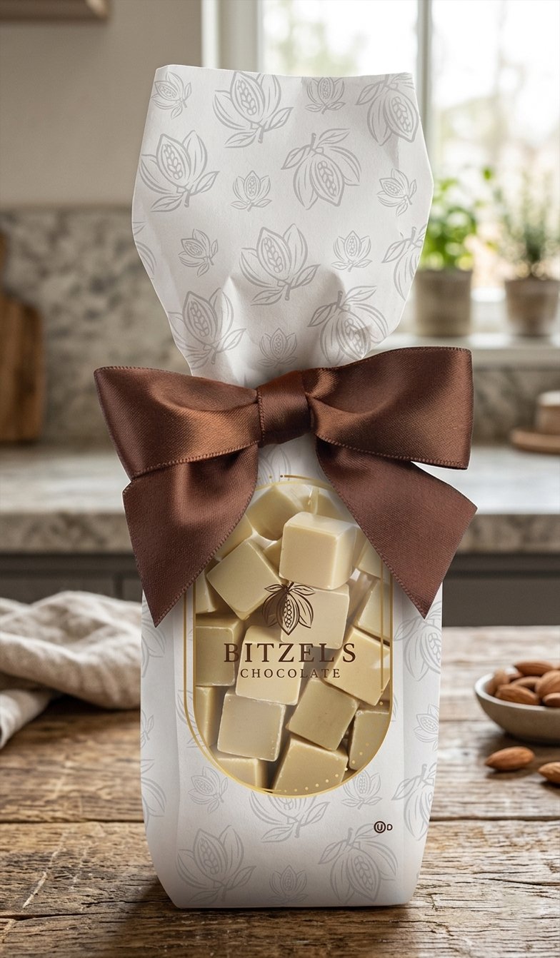
We designed a window gift bag for Bitzel’s chocolate cubes that works across milk, dark and white chocolate, and delivered it as print-ready artwork for all three.
The challenge
A chocolate gift bag has a few jobs at once. It has to look like a gift, show the chocolate inside, and make each flavour easy to tell apart on the shelf. With three flavours, it also had to feel like one brand, not three separate products.
What we designed
- A cocoa-pod patternA hand-drawn cocoa pod and leaf illustration, repeated across the whole bag so it reads as premium from every side, including the gussets.
- An arched window with a gold frameThe window lets the chocolate cubes do the selling. A fine gold double frame and dotted detail make it feel like a label, not just a cut-out.
- One system, three colourwaysThe layout stays identical. Only the background and pattern tone change to match what is inside: brown for milk, near-black for dark, white for white.
Print-ready, not just a mockup
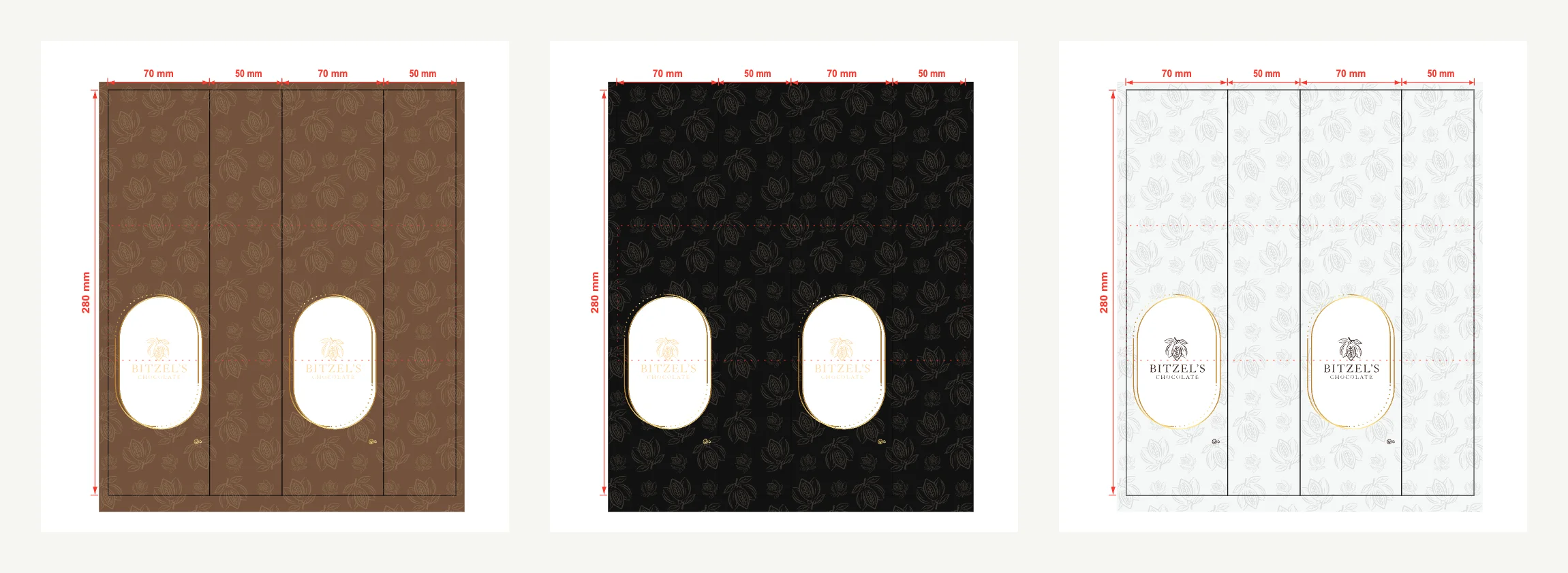
Each colourway was set up on the bag’s flat dieline: 70 mm front and back panels, 50 mm side gussets and a 280 mm height, with the window position and fold lines marked for the printer.
Why it works
Shoppers see the product first, the flavour second and the brand third, which is the order they decide in. Because the system is shared, Bitzel’s can add a new flavour by choosing one new colour, with no redesign needed.
What happened next
Bitzel’s came back to us for more design work after this project. If you’re planning a range of your own, the same approach works for pouches, boxes and labels.
Planning packaging for your product?
Tell us what you’re selling and where. We’ll send a free concept showing how we’d approach the design.