
♛Concept project · Brand identity & packaging
Nook Pet Co.: building a dog-treat brand from scratch
A complete e-commerce brand for a small-batch dog-treat company: logo, colours, type, packaging, Amazon images and launch visuals, designed as one system.
Nook Pet Co. is a concept brand we created to show our process. It is not a real company.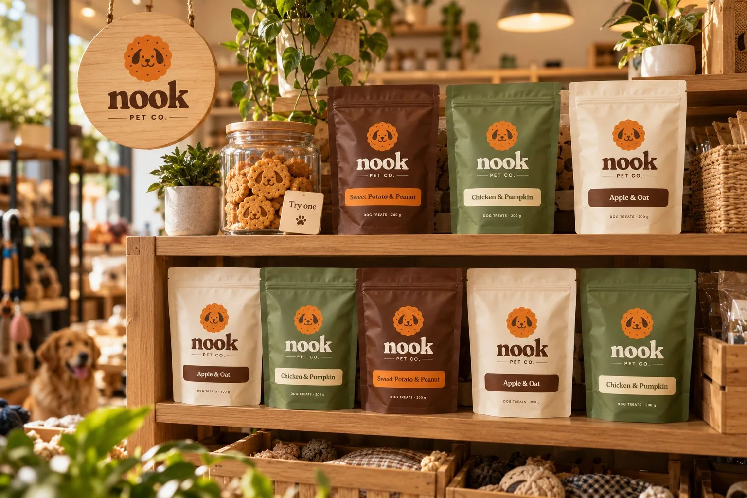
The brief
Dog owners are reading labels more than ever, and the treat aisle (online and off) is crowded with loud, busy packs. We set out to build a brand for owners who read the back of the pack: small-batch treats with short, honest ingredient lists, sold direct and on Amazon.
It had to feel warm and trustworthy, work at thumbnail size in search results, and stretch into a whole flavour range without a redesign.
Brand pillars
- HonestShort ingredient lists, shown up front. Nothing hidden, nothing extra.
- CosyWarm colours, rounded shapes and a calm voice, so every touchpoint feels like home.
- SimpleOne idea per pack, per image, per post. Easy to choose on a shelf or a phone.
The logo
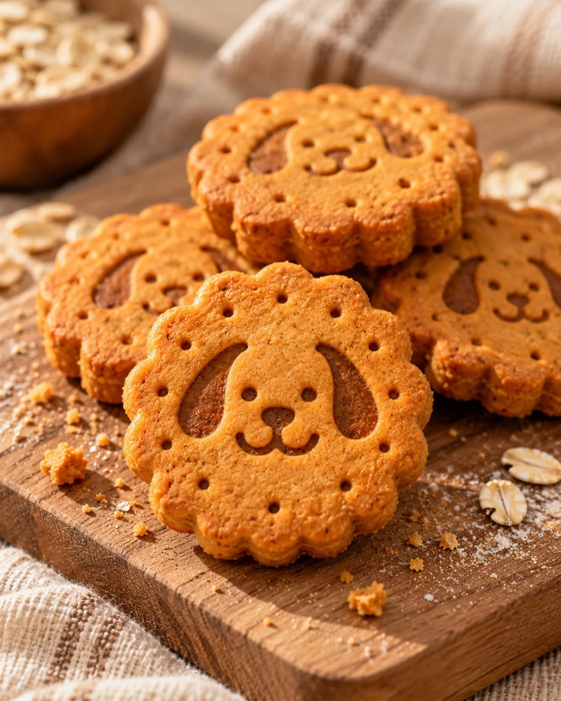
A freshly baked biscuit with a happy dog face pressed into it. The treat and the dog in one shape, readable from a shop shelf down to an app icon.
Colour and type
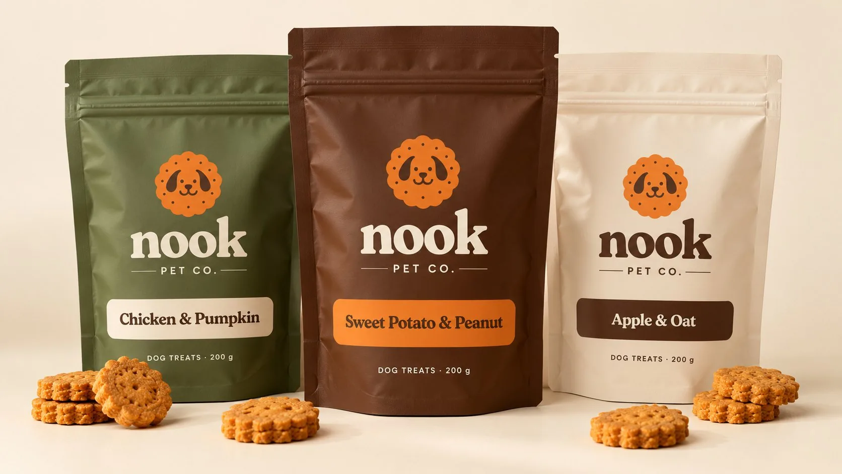
Taken from oats, wood, garden moss and a pumpkin biscuit. Headlines use a soft, rounded serif that feels baked rather than printed; body copy uses a clean sans serif that stays clear at small sizes.
Packaging: one pouch, three flavours
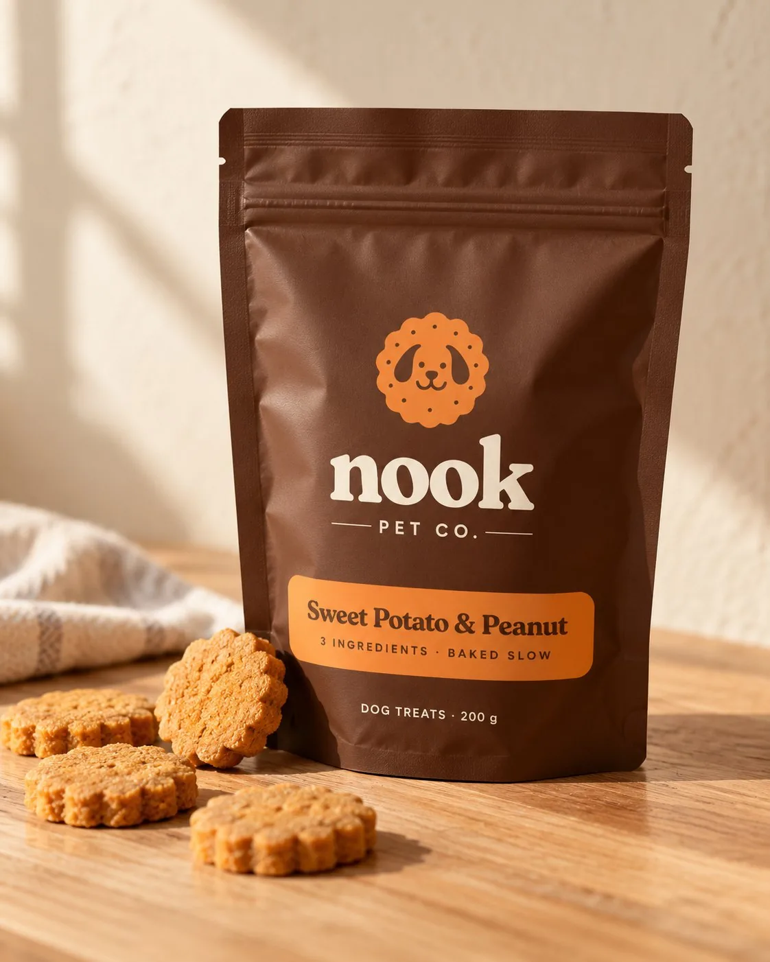
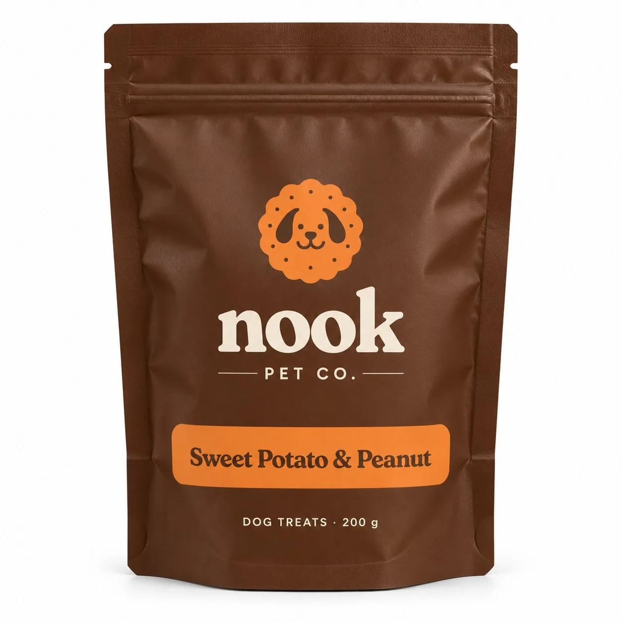
The logo and name never move. Only the pouch colour and flavour band change, so the range reads as one family on a shelf or a search page, and adding a flavour means choosing one new colour.
Built for Amazon from day one
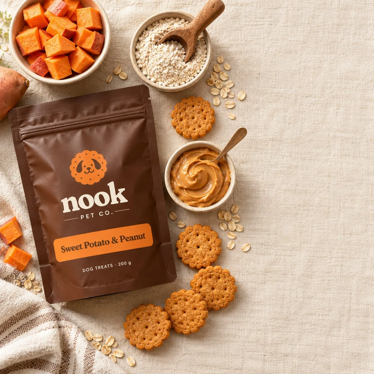
The pack was designed with the listing in mind: high contrast and a big logo for the main image, and real ingredients on show for the infographic images.
The brand in the world
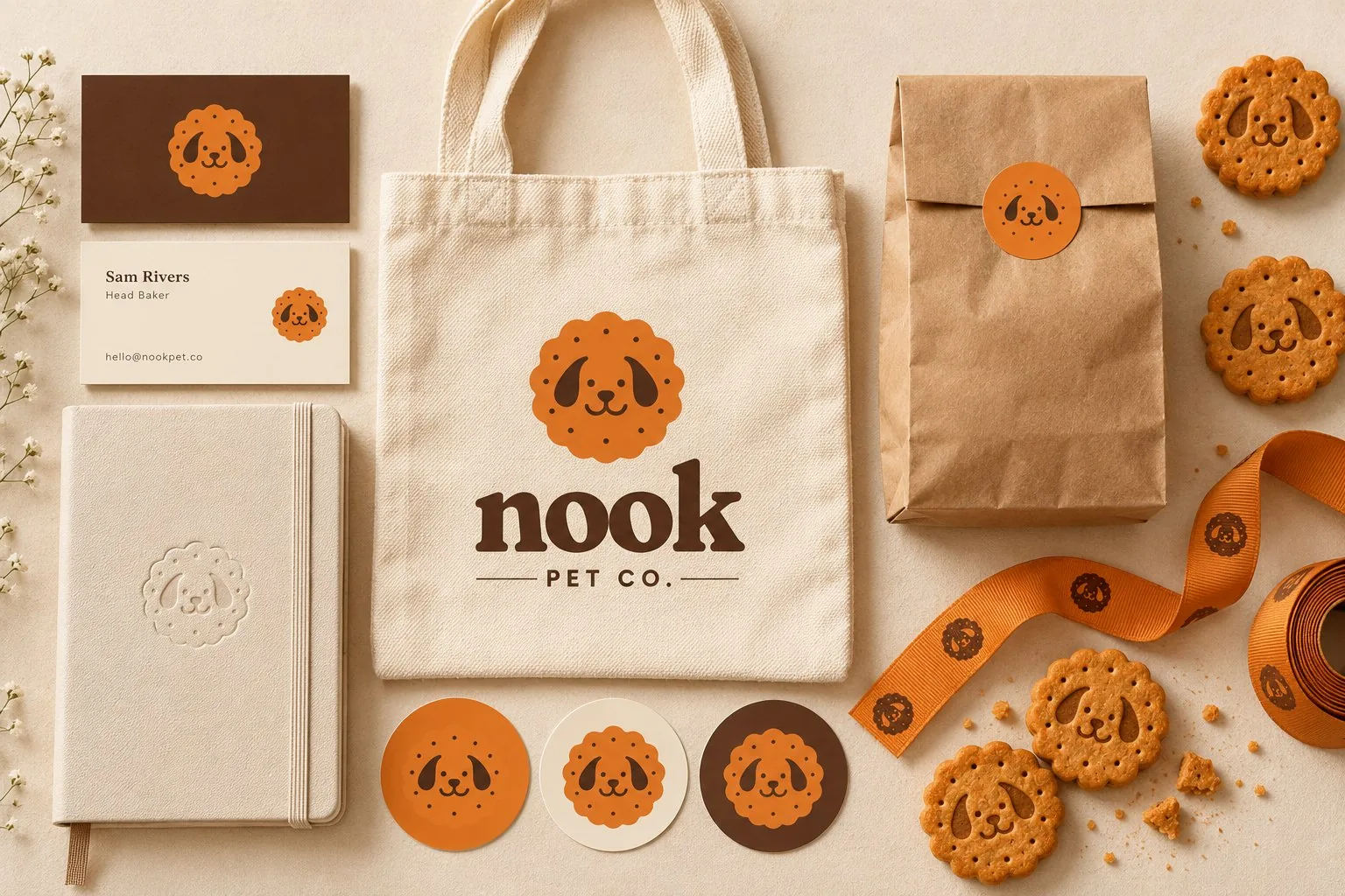
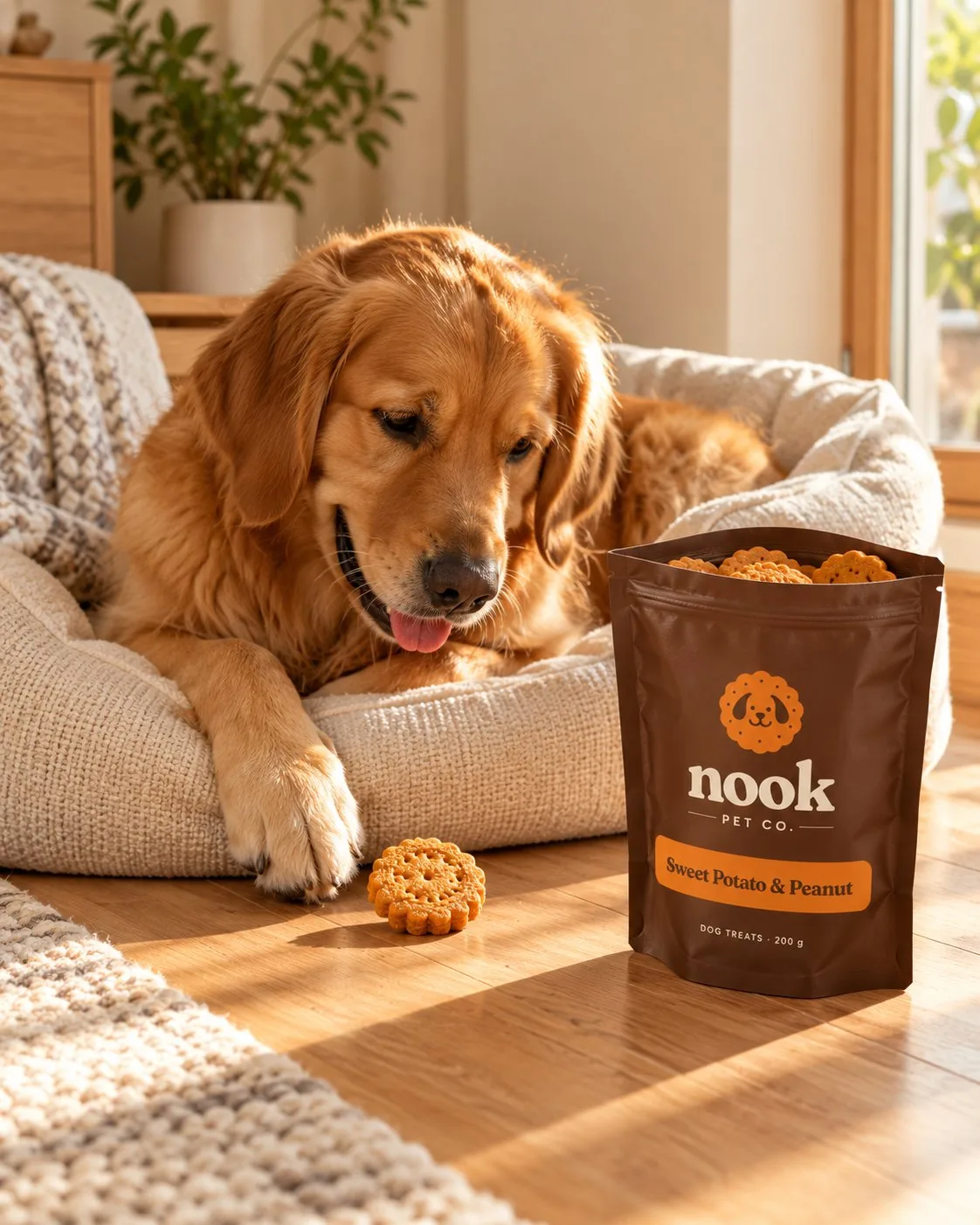
Cards, tote, stickers, ribbon and shop sign all come from the same few parts, so the brand feels consistent from the shipping box to the dog bed.
Why it works
One memorable mark does most of the work. Because the biscuit is both the logo and the product, every pack, post and parcel reinforces the same picture, and customers remember it.
Ready to grow
The system covers new flavours, new pack sizes, A+ content and social posts without a redesign, which is exactly what a young e-commerce brand needs.
Launching a pet or food brand?
Tell us what you’re selling and where. We’ll send a free concept showing how we’d build your brand.